In Part 1 of this article series, we used a Test-first approach to develop a Light component that can be switched on and off again. And we utilized the Accessibility (a11y) API to interact with the component in our tests.
To save time, we have developed the component without mounting it in the React app. Thanks to our tests, we can be confident that the component works – even though we have never seen it visually.
Today we will use a Storybook to style the component and make it look good:
Recap
Before we start, let’s review briefly where we left things off last time.
We ended up with 3 tests:
// src/react/Light.test.js
import { render, screen } from '@testing-library/react'
import userEvent from '@testing-library/user-event'
import Light from './Light'

describe('Light', () => {
  it('is off initially', () => {
    render(<Light />)
    expect(screen.getByRole('status', { name: /light/i }))
      .toHaveDescription(/off/i)
  })

  it('is on when switch is clicked', () => {
    render(<Light />)
    userEvent.click(
      screen.getByRole('button', { name: /switch/i }))
    expect(screen.getByRole('status', { name: /light/i }))
      .toHaveDescription(/on/i)
  })

  it('is off when switch is clicked twice', () => {
    render(<Light />)
    userEvent.click(
      screen.getByRole('button', { name: /switch/i }))
    userEvent.click(
      screen.getByRole('button', { name: /switch/i }))
    expect(screen.getByRole('status', { name: /light/i }))
      .toHaveDescription(/off/i)
  })
})- The light is off initially.
- The light is on when the switch is clicked.
- And it is off again, when the switch is clicked a second time.
These three tests led us to the following Light component implementation:
// src/react/Light.js
import { useState } from 'react'

const Light = () => {
  const [ lightStatus, setLightStatus ] = useState('OFF')
  return (
    <>
      <button onClick={() =>
          setLightStatus(lightStatus === 'OFF' ? 'ON' : 'OFF')
      }>
        Light Switch
      </button>
      <div
        role='status'
        aria-label='light'
        aria-describedby='light.status.description'
      >
        <span id='light.status.description'>
          The light is {lightStatus}
        </span>
      </div>
    </>
  )
}

export default Light
A button click causes the lightStatus to toggle between ON and OFF. And below the button, the component renders the lightStatus together with some text that is embedded in a <span> which is again embedded in a <div>.
People who rely on assistive technologies like screen readers don’t care about <divs> and <spans>. And as app developers, we have to give these users a bit more context. That’s why we augment the DOM with attributes like role or aria-* to give the elements more meaning.
The <div> is marked with the role='status' and the aria-label='light' which makes the <div> the light status. And with the aria-describedby attribute, we turned the text in the <span> into the description of the light status <div>.
People with disabilities cannot rely on the DOM. Instead, they rely on the Accessibility Tree. The Accessibility Tree is present in all browsers. It represents a less technical, simpler view of your page content that is more meaningful to people who struggle to interact with our visual representation based on the DOM.
Our tests also interact with the Light component through the Accessibility API.
That means we are not trying to find a button, for instance, throught the traditional DOM API. We do not say something like:
document.getElementsByClassName('switch')[0]Instead, we are looking for accessible elements by role and name. That’s what a blind person would “see” when they were to interact with our component. We say something like:
screen.getByRole('button', { name: /switch/i })Which translates to “Please get me the button that is labeled with the word switch.”
Running the tests with:
npm testConfirms, the component is working:
PASS src/react/Light.test.js
  Light
    ✓ is off initially
    ✓ is on when switch is clicked
    ✓ is off when switch is clicked twice
Storybook
The Light component is fully functional, but visually we have not seen it yet. So let’s finally render and style the component.
But rather than working on the component in the app – which involves starting the app, navigating to the component, and styling it there – let’s style it in a Storybook.
A Storybook is like a component library. In a well-maintained Storybook, you can find most project components, and you can see how they look. And you can style new components conveniently and more efficiently without starting the app.
But the benefits of a Storybook don’t end here. You can also interact with the components and see how they behave. And you can find code snippets you can copy and paste into your code. A Storybook can be an excellent reference on how to use all the different components in your project.
Show, don’t tell.
Let’s setup Storybook in our React project:
npx storybook initAnd let’s see if that worked by starting the Storybook:
npm run storybookThe init command created a few demo stories for us, but we don’t need them. You can delete the whole src/stories/ folder.
Instead, let’s add our Light component. Let’s create our own story file:
// src/react/Light.stories.js
import Light from './Light'
export default {
title: 'home/Light',
component: Light,
}
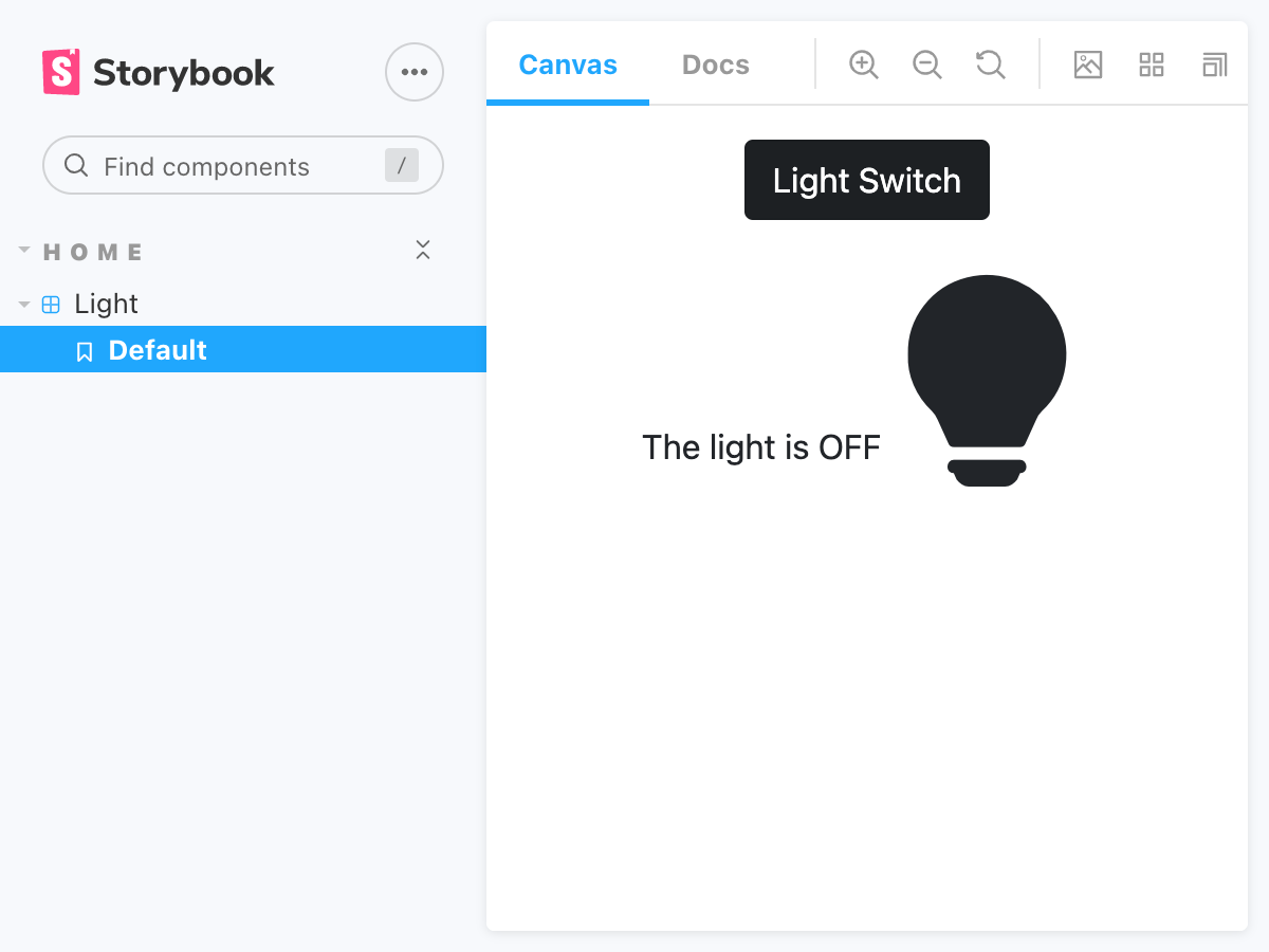
export const Default = () => <Light />After refreshing the browser, the Storybook now shows a section HOME, and inside we can find the Light component. When we select the Default story of Light, we can see that the component works. But it looks like crap:
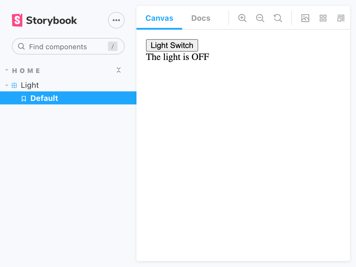
The Light Switch
Ok, let’s style it then. Today, we will use the styling library Bootstrap for that.
npm install bootstrapAfter installing Bootstrap as a dependency, let’s make sure it’s loaded before the component is displayed. We achieve this by modifying Storybook’s preview.js.
// .storybook/preview.js
import 'bootstrap/dist/css/bootstrap.css'

// ...
Now bootstrap.css will be rendered into the HTML head section of each story displayed in Storybook.
Let’s add some Bootstrap CSS classes and see if we can make our Light component look a bit nicer:
// src/react/Light.js
import { useState } from 'react'
const Light = () => {
const [ lightStatus, setLightStatus ] = useState('OFF')
return (
<div className='text-center'>
<button
className={
`btn btn-${lightStatus === 'OFF' ? 'dark' : 'light'}`}
onClick={
() => setLightStatus(lightStatus === 'OFF' ? 'ON' : 'OFF')}
>
Light Switch
</button>
<!-- ... -->
</div>
)
}
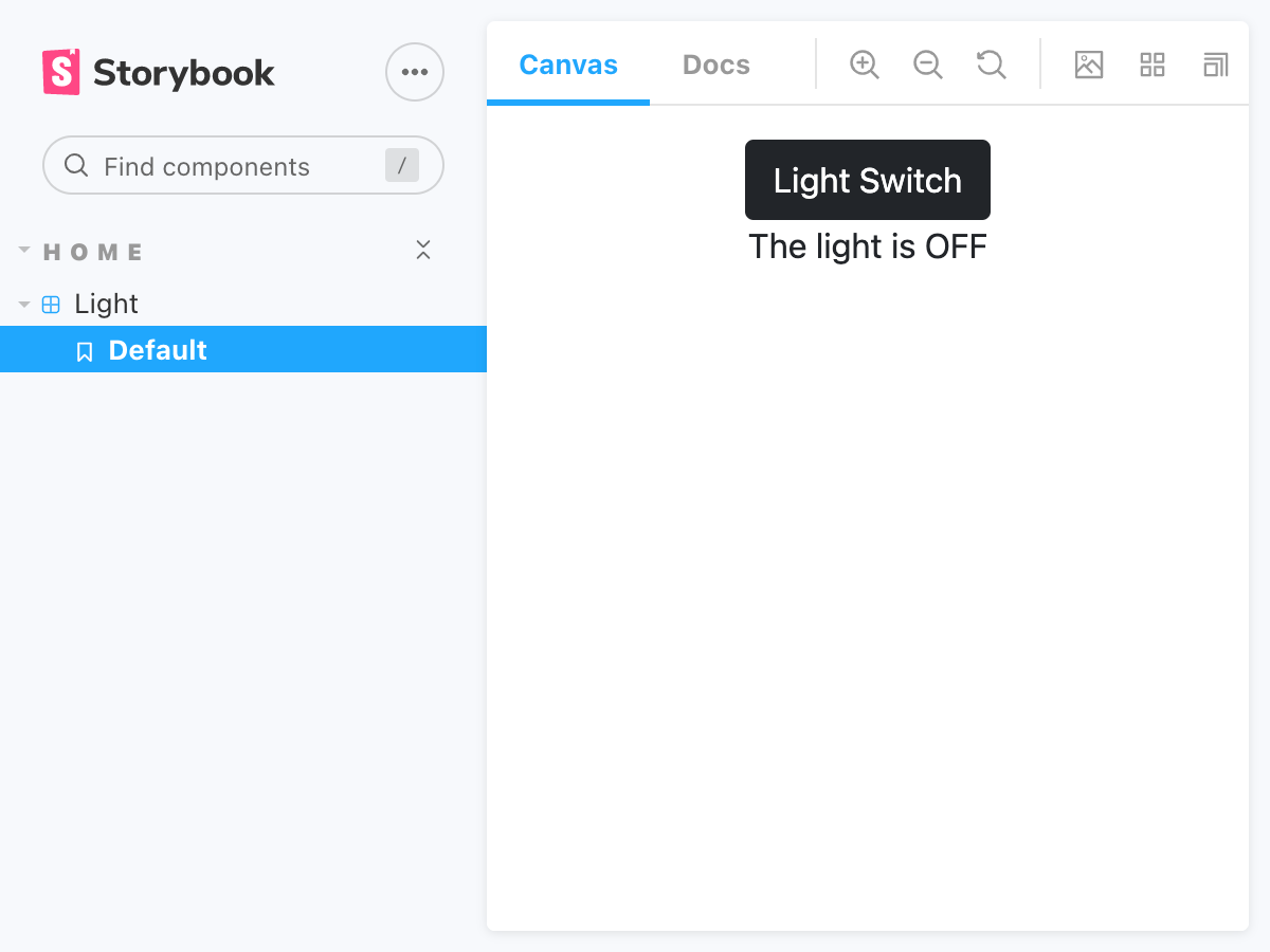
export default LightFirst, we center all content by wrapping the switch button and the light status <div> in a <div> that centers its children with text-center.
Then, we style the button with the class btn. And depending on the lightStatus, the button will be either displayed as btn-dark or as btn-light.
By clicking the button in Storybook, we can demonstrate that the button changes its color.
And if we run the tests:
npm testWe can see that all tests are still passing. We did not break the functionality. We just changed the look & feel.
The Light Bulb
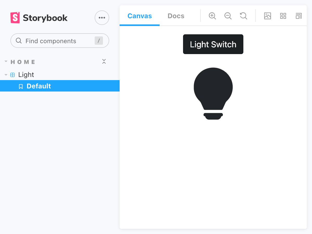
Next, let’s style the light status.
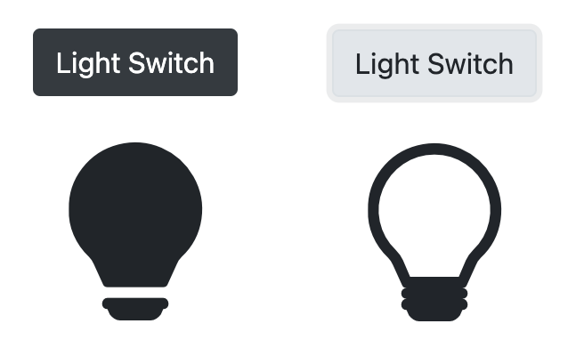
Instead of displaying the currently visible text, we want to see a light bulb. Let’s use Bootstrap Icons for that:
npm install bootstrap-iconsAfter installing the dependency, let’s again make sure it’s loaded before the component is displayed:
// .storybook/preview.js
import 'bootstrap/dist/css/bootstrap.css'
import 'bootstrap-icons/font/bootstrap-icons.css'

// ...
Thanks to Bootstrap Icons, we can now simply add an <i> tag with a class name like bi bi-lightbulb:
// src/react/Light.js
<!-- ... -->
<div
  role='status'
  aria-label='light'
  aria-describedby='light.status.description'
>
  <span id='light.status.description'>
    The light is {lightStatus}
  </span>
  <i className="bi bi-lightbulb" style={{ fontSize: 100 }} />
</div>
<!-- ... -->
But it would be nice if the icon changed according to the lightStatus. So let’s add this behavior:
// src/react/Light.js
<!-- ... -->
<i
  className={`bi bi-lightbulb${lightStatus === 'OFF' ? '-fill' : ''}`}
  style={{ fontSize: 100 }}
/>
<!-- ... -->
When the lightStatus is OFF, we will render a filled light bulb, and when the lightStatus is not OFF, we will render a regular light bulb.
Visually vs. Semantically Hidden
Now that we have the light bulb, there is no need anymore for the written status: “The light is: ON/OFF”.
But we cannot just delete it. Here are two reasons:
a) Our tests would start to fail because they are actually looking for this text. Our tests cannot comprehend what a light bulb is.
b) Our users who rely on the Accessibility API would also lose the ability to use the component. A blind person cannot see the light bulb.
What we can do instead is hide the text visually. We can achieve this, for instance, with Bootstrap’s visually-hidden class:
// src/react/Light.js
<!-- ... -->
<span id='light.status.description' className='visually-hidden'>
  The light is {lightStatus}
</span>
<!-- ... -->
Now the text is hidden visually but not semantically. It’s still in the Accessibility Tree. We can prove that by looking at the tests. Hit enter to re-run them. They are all still passing.
By the way, you can also hide things from the Accessibility Tree (semantically) while keeping it visible (visually) with the attribute aria-hidden:
// src/react/Light.js
<!-- ... -->
<i
  className={`bi bi-lightbulb${lightStatus === 'OFF' ? '-fill' : ''}`}
  style={{ fontSize: 100 }}
  aria-hidden
/>
<!-- ... -->
Removing elements from the Accessibility Tree can be helpful when a page or component has content that does not provide any value to users who rely on the Accessibility API. The aria-hidden attribute is supported by all browsers out of the box.
Here the <i> tag is just there to show something visually. It has no meaning for consumers of the Accessibility API. That’s why we hide it semantically.
Now the Light component looks much better.
A little refactoring
One minor thing we can improve in our Light component is state management.
Currently, we are managing a state that contains the word representing the light status. It’s either ON or OFF, and initially, it’s OFF.
const [ lightStatus, setLightStatus ] = useState('OFF')
// ...
onClick={() => setLightStatus(lightStatus === 'OFF' ? 'ON' : 'OFF')}>
And whenever we want to render something different depending on this status, we have to know about the word OFF:
lightStatus === 'OFF' ? 'dark' : 'light'That’s not very elegant. If we wanted to change this human-readable text, we would have to touch 5! locations in our code.
One option is to move the string OFF into a constant and to use the constant instead:
const STATUS_OFF = 'OFF'
// ...
lightStatus === STATUS_OFF ? 'dark' : 'light'
The string value of the constant could change without having to touch other lines of code.
But I want to use a different approach.
Rather than managing the word that represents the light status, let’s manage a boolean light status:
const [ isLightOn, turnLightOn ] = useState(false)
// ...
onClick={() => turnLightOn(!isLightOn)}
Having a boolean value means we have to adjust the locations where we consume this value:
<button
  className={`btn btn-${isLightOn ? 'light' : 'dark'}`}
<!-- ... -->
<span /* ... */>
  The light is {isLightOn ? 'ON' : 'OFF'}
<!-- ... -->
<i
  className={`bi bi-lightbulb${isLightOn ? '' : '-fill'}`}
Notice, that isLightOn has the opposite meaning of lightStatus === 'OFF'. That’s why we have to also flip the two values produced by the ternaries.
Here’s the full component again:
// src/react/Light.js
import { useState } from 'react'

const Light = () => {
  const [ isLightOn, turnLightOn ] = useState(false)
  return (
    <div className='text-center'>
      <button
        className={`btn btn-${isLightOn ? 'light' : 'dark'}`}
        onClick={() => turnLightOn(!isLightOn)}
      >
        Light Switch
      </button>
      <div
        role='status'
        aria-label='light'
        aria-describedby='light.status.description'
      >
        <span
          id='light.status.description'
          className='visually-hidden'
        >
          The light is {isLightOn ? 'ON' : 'OFF'}
        </span>
        <i
          className={`bi bi-lightbulb${isLightOn ? '' : '-fill'}`}
          aria-hidden
          style={{ fontSize: 100 }}
        />
      </div>
    </div>
  )
}

export default Light
Integration in the App
Now that we are happy with how the Light component behaves and looks, we are ready to add it to our main application:
// src/App.js
import 'bootstrap/dist/css/bootstrap.css'
import 'bootstrap-icons/font/bootstrap-icons.css'
import Light from './react/Light'

const App = () => {
  return (
    <div className='container text-center'>
      <h1>Home App</h1>
      <div className='card'>
        <div className='card-body'>
          <Light />
        </div>
      </div>
    </div>
  )
}

export default App
Let’s start the app:
npm startAnd have a look:
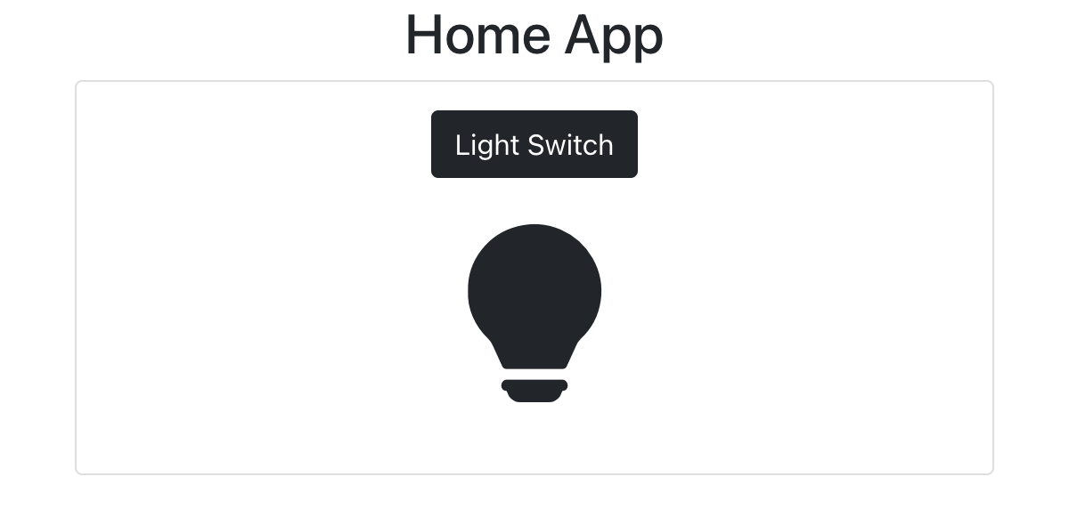
Nice. We started the app only once, and it just works.
Key Takeaways
Here are the important takeaways from this article series:
- With Automated Tests, we can develop functional components more efficiently. We don’t need to test manually over and over again. We don’t have to wait for the app to restart or reload. We can focus on what really matters.
- Testing through the Accessibility API leads to accessible apps that can be used by people who have to rely on assistive technologies.
- Testing through the Accessibility API creates more robust tests that don’t break when implementation details change. Notice that in this second part of this article series, we haven’t touched the tests at all. They always stayed green.
- Tests that utilize the Accessibility API are easier to write and to read than other types of tests. Just ask: “What would the user do or see?” This is much easier to answer than trying to get hold of some HTML element by test-id or class name.
- With Storybook, we can style components more efficiently. There’s no need to wait for the app to restart or reload, and we don’t have to navigate to the component all the time.
- Automated Tests and Storybook represent always up-to-date documentation of our components. That includes how they work, how they look, and how to use them.
Or in short:
Using a Test-first approach and the Accessibility API to develop UI components and styling the component in a Storybook will significantly improve your and your team’s software delivery performance.
And this concludes the article series. I hope you enjoyed it.
See you around,
-David