Software engineering is about writing code that works.
But how do we actually know that our code works?
Well, we have to test it.
Take web apps, for instance. I often see developers implementing new components while the app is running (that always reminds me of a surgeon performing open-heart surgery). But thanks to hot-reloading, changes to the code are visible in the browser within seconds.
Implementing components directly in the running app works until our project grows to a decent size (or someone introduces TypeScript). Then everything becomes a bit sluggish. Hot-reloads take 5 seconds, then 10 seconds, until we start thinking whether it’s worth getting a coffee.
And sometimes, we work on a popup that appears at the end of a 10-page wizard. Now the hot-reload does not only take ages; it also resets the wizard to the first page every time we touch the code.
Here are two things manual testers can do now:
- Option a) For every code change, they click through all 10 wizard pages – and they fill in the required data – until they finally see the popup with the component they are working on.
- Option b) They skip verifying the component for most of their code changes, and they test if everything is working as expected at the end.
But both options come with downsides:
- Option a) is time-consuming, annoying, and tiring.
- Option b) leads to long debugging sessions because they’ve broken their implementation, and they have no clue which code change over the last 60 minutes caused it.
I love solving problems
But what I love even more is to negotiate problems away before I have to solve them.
In this case, let’s eliminate the culprit: The app.
If there is no app, then we don’t have to wait for the hot-reload to finish. And that annoying clicking through the wizard all the time also goes away.
In this article series, I will show you how to build and style a UI component without having to start the app in the first place. Feel free to code along. All you need is a Node.js installation.
Today, we will use Automated Tests and the Accessibility API to create a functional component, and next time we will use a Storybook to style the component.
Along the way, you might be in for a surprise. So pay attention.
Let’s get started.
The component we are going to build shows a light switch that controls a light bulb:
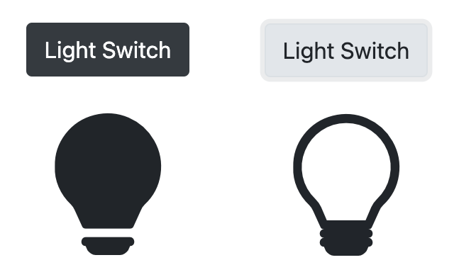
There will be a button. And when the button is clicked, the light bulb will either go on or off.
Let’s assume it’s part of a smart-home solution and that we will later integrate the new component into a web app that can be used to control the light in our home.
Project Setup
First, let’s create a new project folder light, navigate into that new folder, and create a new React app:
mkdir light
cd light
npx create-react-app .
Next, let’s create a folder react:
mkdir src/reactThis is where all the React components go (in some projects, this folder is called components).
In the beginning, there was darkness
Now, let’s start by creating a test file Light.test.js:
touch src/react/Light.test.jsAnd write a test:
// src/react/Light.test.js
import { render, screen } from '@testing-library/react'
import Light from './Light'

describe('Light', () => {
  it('is off initially', () => {
    render(<Light />)
    expect(screen.getByRole('status', { name: /light/i }))
      .toHaveDescription(/off/i)
  })
})
In this test, we’re describing a not-yet-existing Light component. The light should be off initially.
describe('Light', () => {
  it('is off initially', () => {
    // ...
  })
})
To verify that the light is off, we first render the <Light /> component.
render(<Light />)We’re using JSX here, a hybrid of JavaScript and XML/HTML.
The render result will be a Document Object Model (DOM) – very similar to what we have in a browser. And we can access the DOM via screen – which has a similar role to document in a browser.
The verification part of the test might actually be a bit surprising:
expect(screen.getByRole('status', { name: /light/i }))
  .toHaveDescription(/off/i)
First, we get hold of a (not-yet-existing) element with the role status and the name /light/i.
The name can actually be anything, as long as it contains the word light. The i in the regular expression stands for case-insensitive and makes sure the test does not fail just because light is spelled, let’s say, with an uppercase first letter Light.
Once we got the light status element, we expect that it has a description containing the word /off/i.
But why do we not expect something light-bulb-related?
Why do we expect a status element with the name light to have a description including the word off?
Accessibility (a11y)
Here’s the reason:
The most elegant way to test a UI component is to do it exactly as an actual user would do it.
And in this case, we are not talking about any user. We are talking about users that rely on the Accessibility API.
When we look at a web app, we don’t see divs and spans. And when users with vision impairment “look” at a web app, they cannot see what the browser makes out of the divs and spans either. They actually wouldn’t be able to see a light bulb.
So how do these users interact with our app then?
They use assistive technologies like screen readers or refreshable braille displays.
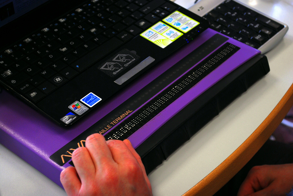
And these assistive technologies interact with the browser using the Accessibility Tree.
We can imagine the Accessibility Tree as a simplified version of the DOM. It’s stripped down to what matters to the user.
divs, spans, classes, and style attributes don’t matter to the user and are therefore not mentioned in the Accessibility Tree.
What can be found on the Accessibility Tree, however, are the input controls and the text. Because that’s what a user can see and interact with.
So if there are no divs and spans on the Accessibility Tree, what is it made of then?
The Accessibility Tree is made of elements that have roles. And each element can have a name and a description.
As developers, we have to make sure that our apps are accessible to most users. That means we have to make sure that our components are meaningful when interacting with them through the Accessibility Tree.
We can achieve this mostly by using HTML tags as intended. An <h1> tag, for instance, will result in an element that has the role heading on the Accessibility Tree.
By the way, about 18% of all EU citizens are affected by a disability to some degree. And as developers, we should care. Over the next 5 years, every member state of the EU has to adopt the European Accessibility Act, and this will most likely affect the one or other app experience you and I are going to create.
We don’t know what HTML markup the Light component will actually produce at this point in time. And that’s ok. It doesn’t matter from the user’s perspective – and it shouldn’t matter from the perspective of the test.
Our tests shouldn’t know about implementation details anyway. Tight coupling between tests and implementation is a massive pain in the ass. It makes refactoring really hard and leads to code that is not fun to work with.
What we can do in our test, however, is to expect that there will be an element with the role status and a name that contains the word light. And that this element will have a description containing the word off.
expect(screen.getByRole('status', { name: /light/i }))
  .toHaveDescription(/off/i)
Let’s run the test…
npm testIt results in a failure:
 FAIL  src/react/Light.test.js
  ● Test suite failed to run

    Cannot find module './Light' from 'src/react/Light.test.js'
And that’s ok. There is no Light component yet.
So let’s implement it to make the failing test pass.
// src/react/Light.js
const Light = () => (
  <div role='status' aria-label='light'
      aria-describedby='light.status.description'>
    <span id='light.status.description'>
      The light is OFF
    </span>
  </div>
)

export default Light
The Light component will be rendered as a <div> with the role status and the name light. With the aria-label attribute, we can give elements a name that is “visible” to users who use the Accessibility API.
The light status <div> has some text as a child component that says: The light is OFF.
By wrapping this text in a <span> and giving the <span> the id light.status.description, we can reference it elsewhere. In this case, we use the aria-describedby attribute on the <div> to mark the text as the description of the light status <div>.
Users who rely on the Accessibility API can “see” two things now:
- A
statuselement with the namelight. - And some text.
But there is one more thing these users will be made aware of:
The text is not just some random text – it is semantically also the description for the light status element.
Let’s rerun the test (just save your changes and wait a second).
This time the test passes:
 PASS  src/react/Light.test.js
  Light
    ✓ is off initially
We just implemented a Light component with a status that informs the user that the light is off.
Let there be light
Notice that there is no light switch yet and also no light bulb.
The light bulb is just a nice-to-have gimmick for people who can see. We will deal with that later when it comes to styling our component.
The light switch, however, is essential. We need it to operate the light.
So let’s work on the light switch next. Let’s write another test:
// src/react/Light.test.js
import { render, screen } from '@testing-library/react'
import userEvent from '@testing-library/user-event'
import Light from './Light'

describe('Light', () => {
  // ...

  it('is on when switch is clicked', () => {
    render(<Light />)
    userEvent.click(
       screen.getByRole('button', { name: /switch/i }))
    expect(screen.getByRole('status', { name: /light/i }))
      .toHaveDescription(/on/i)
  })
})
In this second test, we render the <Light /> again.
And this time, we try to get hold of a button called switch:
userEvent.click(screen.getByRole('button', { name: /switch/i }))We try clicking on it, and we expect the light status element’s description to now contain the word /on/i:
expect(screen.getByRole('status', { name: /light/i }))
  .toHaveDescription(/on/i)
Remember, we use a regular expression /on/i instead of a fixed string "on" because we don’t want to pin the description down to just this one word in exactly that spelling. As long as the description contains the word on or ON somewhere, the test will be satisfied.
Running the test (just save the file) results in a failure:
 FAIL  src/react/Light.test.js
  ● Light › is on when switch is clicked

    TestingLibraryElementError: Unable to find an accessible element with the role "button" and name `/switch/i`
Apparently, there is no button with the name switch.
Further down in the log output, we can see the actual render result.
<body>
  <div>
    <div
      aria-describedby="light.status.description"
      aria-label="light"
      role="status"
    >
      <span
        id="light.status.description"
      >
        The light is OFF
      </span>
    </div>
  </div>
</body>
This can become helpful when we need to debug an unexpected error.
But our error is not unexpected. We know why the test cannot find the switch. We haven’t added one yet.
So let’s do it. Let’s add a <button> with the label Light Switch.
// src/react/Light.js
const Light = () => (
  <>
    <button>Light Switch</button>
    <div role='status' aria-label='light'
        aria-describedby='light.status.description'>
      <span id='light.status.description'>
        The light is OFF
      </span>
    </div>
  </>
)

export default Light
When we rerun the test, we get now a different error message:
 FAIL  src/react/Light.test.js
  ● Light › is on when switch is clicked

    expect(element).toHaveDescription()

    Expected the element to have description:
      /on/i
    Received:
      "The light is OFF"
We expect to “see” the word ON in the description, but it still says The light is OFF.
Ok, let’s fix that.
The component needs to show OFF in one moment and ON in the next moment. Looks like we need to introduce some state – some state that can change when the user interacts with the component:
// src/react/Light.js
import { useState } from 'react'

const Light = () => {
  const [ lightStatus, setLightStatus ] = useState('OFF')
  return (
    <>
      <button onClick={() => setLightStatus('ON')}>
        Light Switch
      </button>
      <div role='status' aria-label='light'
          aria-describedby='light.status.description'>
        <span id='light.status.description'>
          The light is {lightStatus}
        </span>
      </div>
    </>
  )
}

export default Light
In this case, we’re using the useState hook which gives us the current state lightStatus, and a mutator setLightStatus that we can use to change the state. The initial lightStatus is OFF:
const [ lightStatus, setLightStatus ] = useState('OFF')When the light switch is clicked, we simply set the lightStatus to ON:
<button onClick={() => setLightStatus('ON')}>
  Light Switch
</button>
And in the description, we make sure to render the current lightStatus:
<span id='light.status.description'>
  The light is {lightStatus}
</span>
React will make sure that the component will re-render whenever the lightStatus state changes.
Now both tests are green.
 PASS  src/react/Light.test.js
  Light
    ✓ is off initially
    ✓ is on when switch is clicked
It seems to work.
Lights out
And what about turning the light off again?
Can the light actually be turned off?
In Germany, we have a variant of “better safe than sorry”:
Vertrauen ist gut, Kontrolle ist besser.
It translates to “Trust is good, control is better.”
Let’s write a test to make sure that the light can be turned off again:
// src/react/Light.test.js
// ...

describe('Light', () => {
  // ...

  it('is off when switch is clicked twice', () => {
    render(<Light />)
    userEvent.click(
      screen.getByRole('button', { name: /switch/i }))
    userEvent.click(
      screen.getByRole('button', { name: /switch/i }))
    expect(screen.getByRole('status', { name: /light/i }))
      .toHaveDescription(/off/i)
  })
})
This time we render the <Light /> component, and we click the switch twice.
Then we expect the light status description to contain the word off.
The test fails:
 FAIL  src/react/Light.test.js
  ● Light › is off when switch is clicked twice

    expect(element).toHaveDescription()

    Expected the element to have description:
      /off/i
    Received:
      "The light is ON"
The light stays ON…
Good that we checked. Let’s fix it:
// src/react/Light.js
// ...
<button onClick={
  () => setLightStatus(lightStatus === 'OFF' ? 'ON' : 'OFF')
}>
  Light Switch
</button>
// ...
If the lightStatus is OFF, set it to ON and otherwise set it to OFF.
That satisfies the test. All tests are passing now.
 PASS  src/react/Light.test.js
  Light
    ✓ is off initially
    ✓ is on when switch is clicked
    ✓ is off when switch is clicked twice
Great!

Now witness the power of this fully operational Light component.
The Light component is functional.
And we’ve actually managed to implement a Light component – without starting the React app once.
Yes, we haven’t seen yet how the component looks like in a browser, but we can be confident that it works.
Thanks to tests and Accessibility API, the component is ready to be used by anyone who relies on assistive technologies.
All right. That’s enough for today.
In Part 2 of this article series, we will use a Storybook to ensure our Light component is not just functional but also an “eye-catcher.” And we will see that changing implementation details will actually not break the tests.
See you around,
-David